Wednesday, 12 December 2012

Movie Trailer and Poster analysis: The First Movie - Mewtwo vs Mew

Pokemon - The First Movie was as much as a childhood memory as My Neighbour Totoro (see previous posts). So... here's my analysis of Pokemon - The First Movie!

Pokemon - The First Movie- Movie Trailer Analysis

By viewing the trailer you can tell that it is a cartoon child/family film. It seems to be aimed mainly at young males but Pokemon is well known amoung younger children which is why its target audience is children.


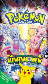
Pokemon - The First Movie

The movie poster contains many pokemon but the main pokemon shown are Mewtwo, Mew and Pikachu. The top half is quite different to the bottom as the video/dvd contains the main movie and a short movie called 'Pikachu's Vacation'. The background of the bottom half is of the sunny island that the pokemon stayed at in 'Pikachu's Vaction' and the background of the top half is of the area where the main battle of Mewtwo and Mew happens.
People who haven't watched it before will not know this as 'Pikachu's Vacation' is a surprise extra movie.

Film Trailer and Poster Analysis: The Hobbit

The Hobbit; probably the only thing I'm looking forward to more than Christmas!

The genre of the Hobbit is action adventure. This is evident due to Bilbo running, the horses running, spooky abandoned places and the intense music. These all add an 'epic' effect.

The Hobbit Film Poster

The image is of a Hobbit (Bilbo) walking outside of his house through his little house. People who are not LoTR fans may not know this and simply see a man walking out of a circular door.
Beyond the door is sunshine, clouds and open fields and hills. This is showing that there is more beyond. The slogan 'An Unexpected Journey' can help infer that it is an adventure story.

Film Trailer and Poster Analysis: My Neighbour Totoro

My Neighbour Totoro is a major part of my childhood so I thought... why not analyse it for my Media work?!
This movie was made in 1988. It is one of the classic Studio Ghibli films and probably my favourite.
This is the English trailer for the movie.
This movie is a cartoon aimed at children/families. Well... the cartoon bit is pretty obvious however the trailer would be pretty boring for a child to watch. The theme tune being played on the piano and violin and no humorous sections probably wouldn't draw in the attention of a child if you were to compare it to a Disney Pixar movie trailer.

My Neighbour Totoro
The film poster is of Totoro's face smiling. His ears are replaced with trees and the background is of the Japanese forest where the movie is set. On top of Totoro's head/ the hill, is Totoro, the two main female characters and a small baby Totoro.
The bright smiling face is friendly and happy but I can imagine that some children may be frightened by it!

Movie Trailer Analysis: Saw 3D

Our Media coursework is to create a film poster and trailer. For our research and planning; we have to analyse five movie trailers and their posters... so here we go!


Saw 3D (2010) Official Trailer
By viewing the Saw 3D trailer, I can tell that it is a horror movie. This is evident due to the:
Screaming
Weapons
Crying

It can also be classified around the Crime genre due to the pictures, wording, and the lines that have been drawn on the wall at 0:22


The Saw 3D Film Poster

The Saw 3D film poster is of a statue looking head where the top is being blown to pieces. The slogan is 'IN MIND-BLOWING 3D'. This matches the central image of a head being blown off. Haha!
The title Saw 3D is written in red which symbolises blood and danger.

Sunday, 25 November 2012

Saw 3D; Movie Trailer analysis

For my Media homework, we have to analyse a movie trailer by talking about what genre it is and how we can tell.

Saw 3D is horror movie. I can tell this due to:
-Screaming
-Blood
-Weapons
-Graphic scenes
-Running

These all add up to create the horror feeling to the trailer.

Monday, 22 October 2012

Magazine Analysis

In my Media lesson, we had to analyse a magazine cover. We had to chose the magazine covers ourselves but we were not allowed to use a music magazine as that is the theme for the actual exam in 2013.
When analysing, we have to look out for 12 key conventions.
The 12 key conventions:

1. Title of publication
2. Slogan
3. Central image
4. Flash (Text on top of central image)
5. Free offer
6. Colour scheme
7. Name/Game checks (cultural territory)
8. Language
9. Competitions
10. Direct address and Asking questions
11. Barcode, Date and Price
12. The 'real' target audience

The magazine I was analysing had no 'Free offer' or 'Competitions'

Monday, 8 October 2012

Photoshop colour pallet and fruit bowl

In my Media lesson we had to make a colour pallet based on a word that we had to chose from a list. The word I chose was Autumn. This is the colour pallet I made.
I used a range of golden, brown, grey and green as these colours are often seen during autumn.

Our second task was to find a picture that we thought represented Autumn and use the eye-drop tool to use those exact colours to colour in a fruit bowl. This is the fruit bowl I coloured in with the original image at the top.
As I am not very good at using Photoshop, I was very pleased with this outcome.