Wednesday, 12 December 2012

Movie Trailer and Poster analysis: The First Movie - Mewtwo vs Mew

Pokemon - The First Movie was as much as a childhood memory as My Neighbour Totoro (see previous posts). So... here's my analysis of Pokemon - The First Movie!

Pokemon - The First Movie- Movie Trailer Analysis

By viewing the trailer you can tell that it is a cartoon child/family film. It seems to be aimed mainly at young males but Pokemon is well known amoung younger children which is why its target audience is children.


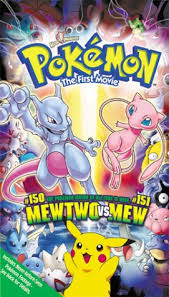
Pokemon - The First Movie

The movie poster contains many pokemon but the main pokemon shown are Mewtwo, Mew and Pikachu. The top half is quite different to the bottom as the video/dvd contains the main movie and a short movie called 'Pikachu's Vacation'. The background of the bottom half is of the sunny island that the pokemon stayed at in 'Pikachu's Vaction' and the background of the top half is of the area where the main battle of Mewtwo and Mew happens.
People who haven't watched it before will not know this as 'Pikachu's Vacation' is a surprise extra movie.

Film Trailer and Poster Analysis: The Hobbit

The Hobbit; probably the only thing I'm looking forward to more than Christmas!

The genre of the Hobbit is action adventure. This is evident due to Bilbo running, the horses running, spooky abandoned places and the intense music. These all add an 'epic' effect.

The Hobbit Film Poster

The image is of a Hobbit (Bilbo) walking outside of his house through his little house. People who are not LoTR fans may not know this and simply see a man walking out of a circular door.
Beyond the door is sunshine, clouds and open fields and hills. This is showing that there is more beyond. The slogan 'An Unexpected Journey' can help infer that it is an adventure story.

Film Trailer and Poster Analysis: My Neighbour Totoro

My Neighbour Totoro is a major part of my childhood so I thought... why not analyse it for my Media work?!
This movie was made in 1988. It is one of the classic Studio Ghibli films and probably my favourite.
This is the English trailer for the movie.
This movie is a cartoon aimed at children/families. Well... the cartoon bit is pretty obvious however the trailer would be pretty boring for a child to watch. The theme tune being played on the piano and violin and no humorous sections probably wouldn't draw in the attention of a child if you were to compare it to a Disney Pixar movie trailer.

My Neighbour Totoro
The film poster is of Totoro's face smiling. His ears are replaced with trees and the background is of the Japanese forest where the movie is set. On top of Totoro's head/ the hill, is Totoro, the two main female characters and a small baby Totoro.
The bright smiling face is friendly and happy but I can imagine that some children may be frightened by it!

Movie Trailer Analysis: Saw 3D

Our Media coursework is to create a film poster and trailer. For our research and planning; we have to analyse five movie trailers and their posters... so here we go!


Saw 3D (2010) Official Trailer
By viewing the Saw 3D trailer, I can tell that it is a horror movie. This is evident due to the:
Screaming
Weapons
Crying

It can also be classified around the Crime genre due to the pictures, wording, and the lines that have been drawn on the wall at 0:22


The Saw 3D Film Poster

The Saw 3D film poster is of a statue looking head where the top is being blown to pieces. The slogan is 'IN MIND-BLOWING 3D'. This matches the central image of a head being blown off. Haha!
The title Saw 3D is written in red which symbolises blood and danger.

Sunday, 25 November 2012

Saw 3D; Movie Trailer analysis

For my Media homework, we have to analyse a movie trailer by talking about what genre it is and how we can tell.

Saw 3D is horror movie. I can tell this due to:
-Screaming
-Blood
-Weapons
-Graphic scenes
-Running

These all add up to create the horror feeling to the trailer.

Monday, 22 October 2012

Magazine Analysis

In my Media lesson, we had to analyse a magazine cover. We had to chose the magazine covers ourselves but we were not allowed to use a music magazine as that is the theme for the actual exam in 2013.
When analysing, we have to look out for 12 key conventions.
The 12 key conventions:

1. Title of publication
2. Slogan
3. Central image
4. Flash (Text on top of central image)
5. Free offer
6. Colour scheme
7. Name/Game checks (cultural territory)
8. Language
9. Competitions
10. Direct address and Asking questions
11. Barcode, Date and Price
12. The 'real' target audience

The magazine I was analysing had no 'Free offer' or 'Competitions'

Monday, 8 October 2012

Photoshop colour pallet and fruit bowl

In my Media lesson we had to make a colour pallet based on a word that we had to chose from a list. The word I chose was Autumn. This is the colour pallet I made.
I used a range of golden, brown, grey and green as these colours are often seen during autumn.

Our second task was to find a picture that we thought represented Autumn and use the eye-drop tool to use those exact colours to colour in a fruit bowl. This is the fruit bowl I coloured in with the original image at the top.
As I am not very good at using Photoshop, I was very pleased with this outcome.

Tuesday, 25 September 2012

Camera Angles.

In our Media class, we had to make a short story using pictures with various angles (as shown in my previous post) so... here they are with a description of the what's happening.
Long shot-
In this shot, there are two figures. One is in a black cloak and the other is in a skull mask.
Medium Long Shot - 
In this shot, it is showing the two figures stabbing a school girl (me ^^)
Long Shot -
In this shot it is showing the school girl falling to the ground.
Extreme Long Shot -
This is showing the school girl running away whilst the murderers aren't looking.
Oblique/Canted angle - 
The girl has collapsed. This shot is showing the school girl reaching for the phone. You can see that the two others are still in the scene.
Close up birds eye view - 
This is showing the girl reaching for the phone. There isn't a shot showing if she's properly reached it or not to give suspense.
Birds eye view -
This is showing a woman who has found the body.
 Medium shot - 
The woman was actually a police officer *GASP
This is showing the women giving proof she's a police officer. She is about to ask the two others if they know anything about the body.
Birds eye view -
The police woman has gone back to look at the body.
Medium shot -
this is showing the two figures slowly walking away.
Medium long shot -
The police officer is now chasing after the two other figures. What happens to the police officer, no one knows.
Low oblique/canted angle -
The end shot is of the cloaked figure. The sky looks dark but the lighter area contrast with the cloak. This is possibly my personal favorite shot we took that lesson.

Wednesday, 19 September 2012

Camera Shots and Angles ~(^___^)~


Today in our Media lesson, we are looking at various camera shots and angles. Not much else to add to that. So... here we go!

Framing or shot length:

Extreme Long Shot - This can be taken from as much as a quarter of a mile away and is generally used for scene setting. It usually shows a form of exterior e.g. The outside of a building, a landscape and is also often used to film action scenes e.g war. It doesn't give much visible detail as it's meant to show a general overview of where the scene is set.


Long Shot - This is meant to show the image as approximatley life size ei corresponding to the distance of the viewer and the cinema screen. This type of shot shows the full length showing the whole human body. The head is near the top of the screen and the feet at the bottom. It focuses on the main charaters but still shows the details of the background e.g. the coffins are in a western styled setting.


Medium Shot - Normally contains a figure from the knees/waist up. This is normally used for dialoge or showing detail in an action/motion. This can include more than one figure, however if there are more than three people in the shot, it usually becomes a long shot. The detail in the background is very minimal and can be blurred to put more focus on whatever you're trying to focus on!


Close-up - This shot shows very little background and focuses on the main topic of the shot. In this example, the face of a cat. It magnifies the face whilst blurring out the background. A close up lets us know what the character is thinking. You would only let someone you trust get that close to your face, wouldn't you? Mothers, children and loved ones would get that close, so a close up would be a very intimate shot. The film maker may use a close-up to make us feel either very comfortable or very uncomfortable about a character.


Extreme Close-up - As its name suggests, it's an extreme version of a close up. It magnifies the what the human eye would experience. An extreme close up could be of something such as an eye like in this picture. It could be used in a sad scene as a tear comes out of the characters eye. Or it could be of other features such as the mouth or nose. As a tight focus is required, extra care must be taken when settinf up lighting. Any camera shaking or an error in focal length is very noticable.


Camera Angles:

 
Bird's eye view - As the name suggests, the camera angle is of what a bird might see whilst in the air. It can give a broad view of a scene, sometimes used in things such as documentaries. It can however, make farmiliar object look unrecognisable e.g. lots of umbrellas open on a rain street. It puts the viewer in almost a 'god like position' as you can see almost everything of a certain area. It can also make people/ things look insignificant e.g lots of people look like a colony of ants.


High Angle Shot - The picture above shows a man filming a high angle shot. It's not as extreme as Bird's eye view but still gives a general view. High angles make the object seem smaller, less insignificant or even scary! It is often used in films where it's portraying a CCTV camera's view of something.


Eye Level - It's a neutral shot. It shows you what a person may be seeing of something that is level to him/her. The camera will usually be place from six to seven feet from the ground.


Low Angle - This shot may help shorter actors appear taller (e.g. Tom Cruise) Low angles give a sense of confusion to a viewer. The added height may inspire the viewer to feel fear or insecure. It can show powerlessness during an action scene. The background of a Low Angle scene is usually the sky or a ceiling. It can sometimes be used to portray the sight that someone may have if they are hiding under a table, hiding behing something etc...


Oblique/Canted Angle - Sometimes a camera is tilted. It sometimes helps to show things such as the charecters facial expression (like in the picture above). It suggests things such as instability, transition and imbalance.


CUT! 
Tuesday, 18 September 2012

Analysing: Asking Alexandria Tour Poster <(^___^)>


Today in our Media lesson. We had to analyse a tour poster for a band/artist.
I'm a massive fan so I knew that Asking Alexandria had a tour poster as my dad offered to get me tickets (yaay)
 The title of the band is Asking Alexandria. There isn't a tour name. (There is one, it's just not presented on the poster)
 The tour dates are:
 January 17th @ Glasgow Barrowlands
 January 19th @ London O2 Academy Brixton
 February 10th @ Birmingham O2 Academy
 February 11th @ Manchester Academy.
 The supporting brand is: Monster (Energy Drink)
 The central image is a side view of a skull with a black hood. The lighter coloured areas are coloured in purple.
 The Bands record label is: Sumerian Records
 From the poster, the target audience is probably Teens and Adults.
 The other bands performing with them (so far) will be: Motionless in White and Betraying The Martyrs (There are now more that are not presented on this poster)


HSBC Campaign


In our GCSE Media class, we had to use Photoshop to create our own HSBC Campaign picture. Here are the ones I made in lesson today :)

 How could I improve my work?
 I could improve my work by making sure that the pictures within the picture are lined up properly. In the Twitter Bird picture, I couldn't manage to make the pictures inline so it looks slightly 'unprofessional'
 I actually spent quite a while trying to make them inline but it wouldn't :(

 Apart from that small hiccup, I am proud of my work as this is my first time using Photoshop properly ^^

Why I chose GCSE Media

 
For my GCSE media homework, I have to write a blog on why I chose GCSE Media.

 So, let's get to it!

 I chose GCSE media because my sister did whilst in High School. She said it was fun and I was sometimes included in her homework of recording various adverts and film promo's.

 What do I expect from GCSE Media?

 Well, I know that it's going to be hard work with all the coursework, however I think it's going to be really good fun! I enjoy things such as poster making and also filming and photography so.... this year should be interesting!